
A chilli sauce company aimed to create an adaptable brand that could showcase their diverse range of sauces while maintaining a consistent visual identity. Our mission was to develop a cohesive brand strategy that highlighted each sauce’s unique flavour while ensuring brand uniformity across all products.
Chilli Republic, an independent company known for crafting exquisite jams, sauces and mayonnaises, sought to elevate their product presentation through packaging.
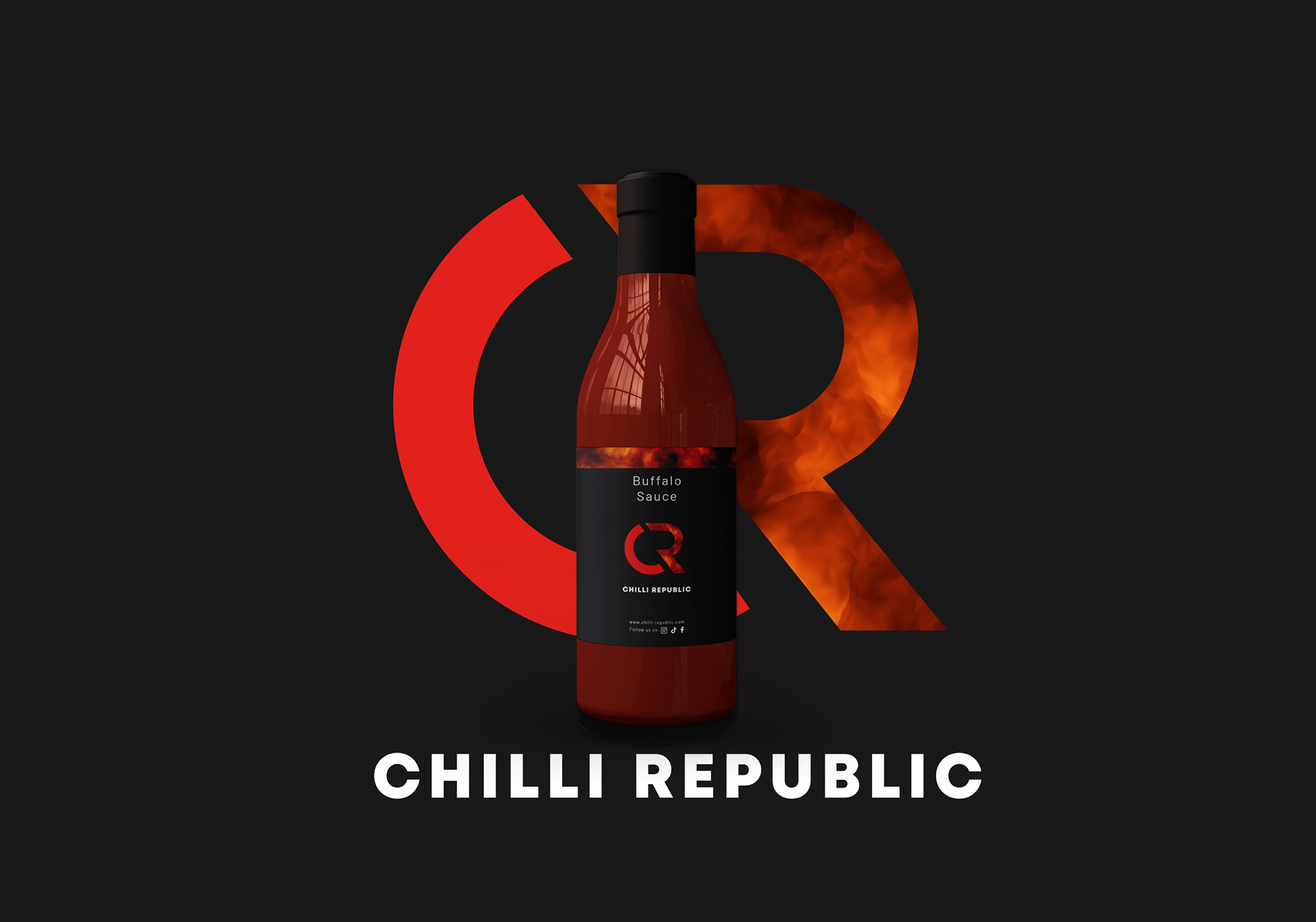
The Chilli Republic logo had been designed by a colleague, so with that in hand I started the creative journey of designing labels that would compliment the array of products offered.
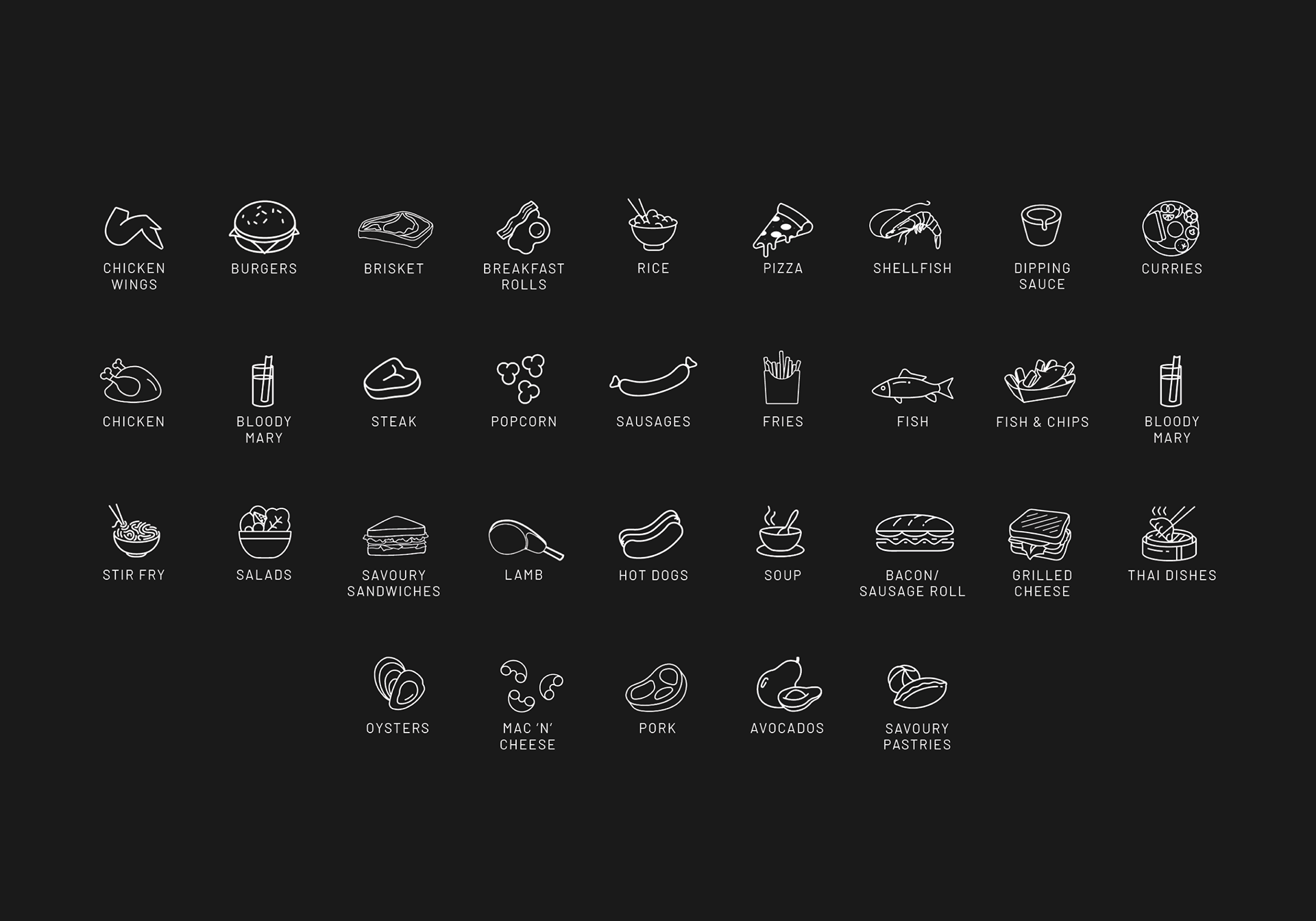
Drawing inspiration from the “pairing suggestion” the client had provided, I designed a dynamic catalogue for each suggestion allowing for them to be swapped out seamlessly depending on the product.

With the company only having a logo, the packaging was a close collaboration with the client navigating them through variations of designs to land on the final concept.

Using distinct imagery for each product to be used as a banner at the top of the label as well as in the “R” of the logo, the family of products became recognised as “Chilli Republic” products giving a lasting impression on customers.
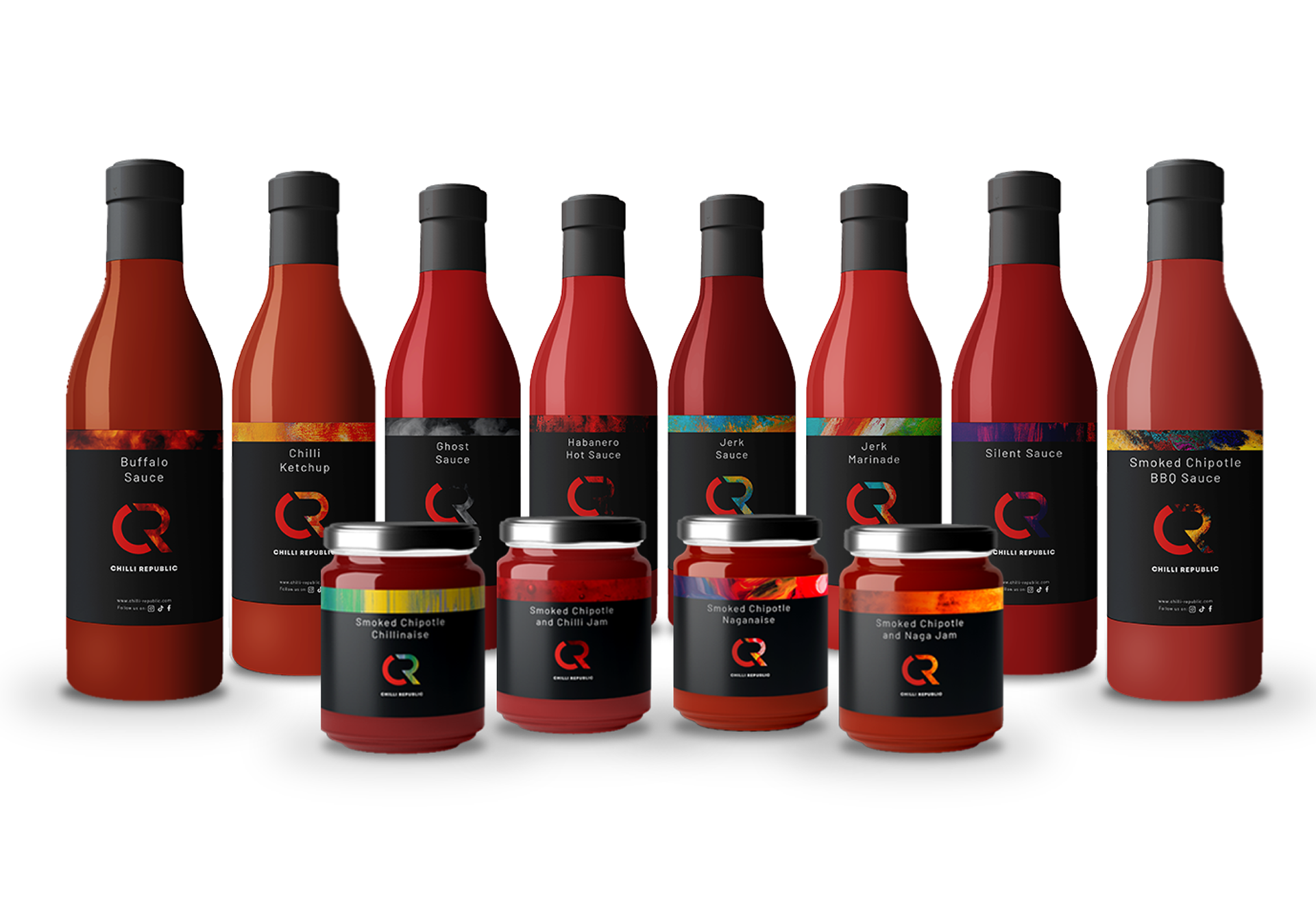
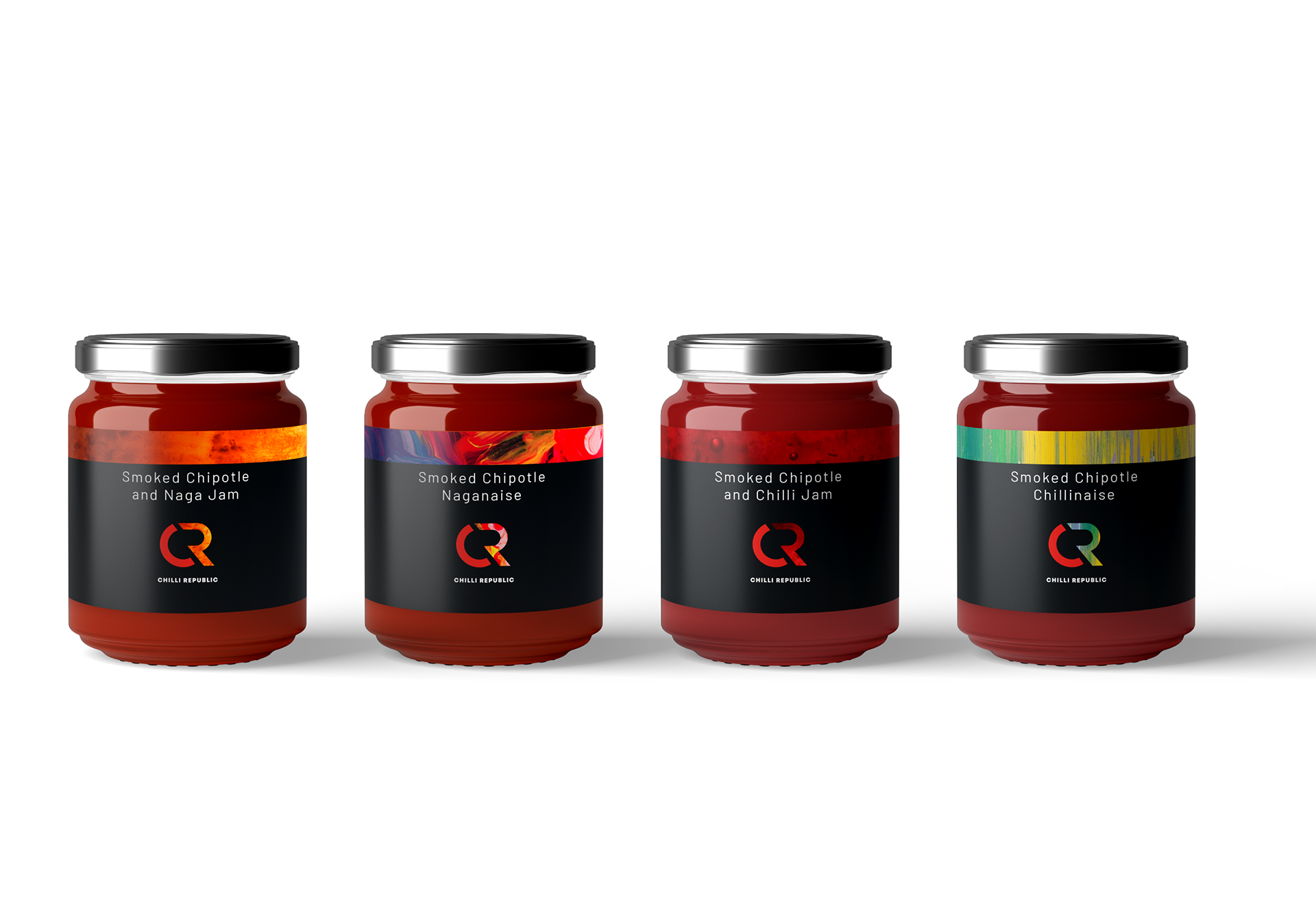
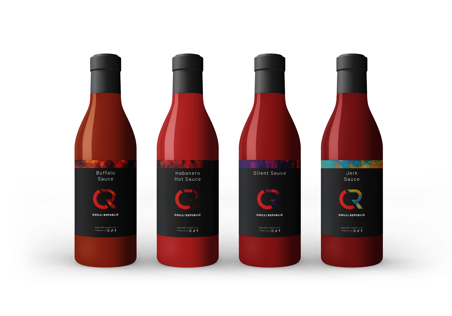
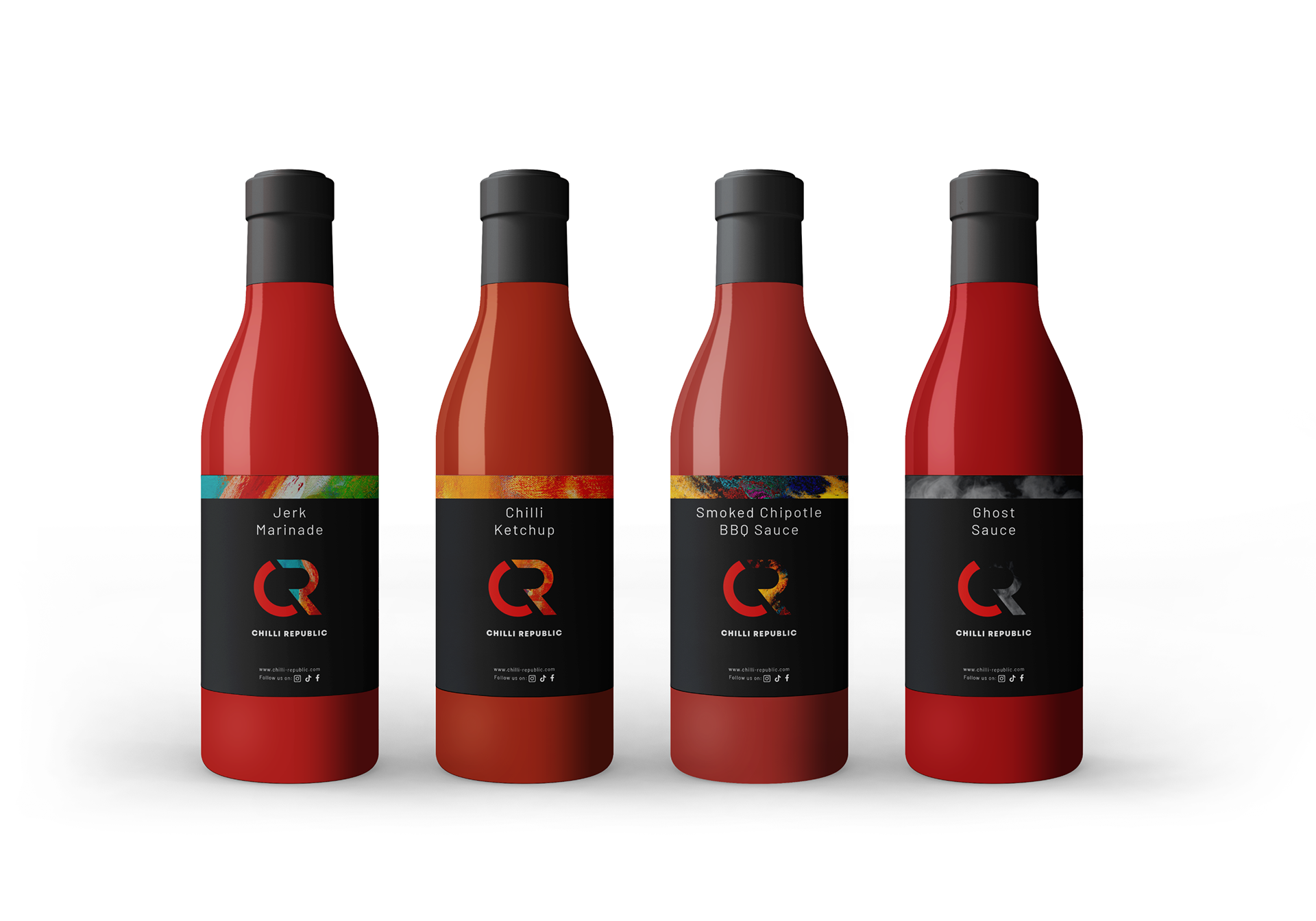
Utilising the logo as a solid foundation, each product emerged as a unique sensory experience, visually representing the diverse flavour in each product.