DEVELOPING THE LOGO FOR PATHWAYS.
Pathways Education helps to support young people and their families with Special Educational Needs and Disabilities (SEND). Working with young people, the company improves their confidence, re-connect them with education as well as raise awareness for inclusive education across school boards within the UK.
Pathways had commissioned their logo to be redesigned, however they felt as though it wasn’t complete. They asked for a redesigned logo with new colours and a brand exploration for it’s guidelines.
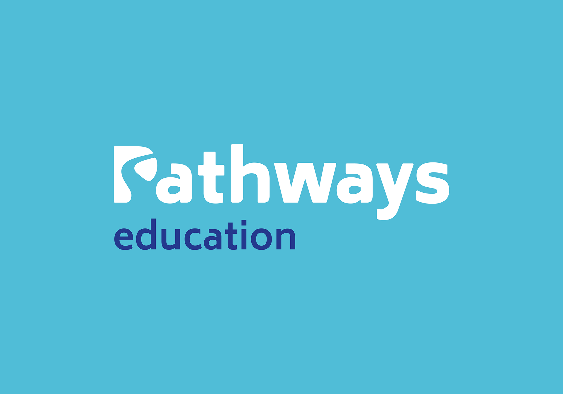
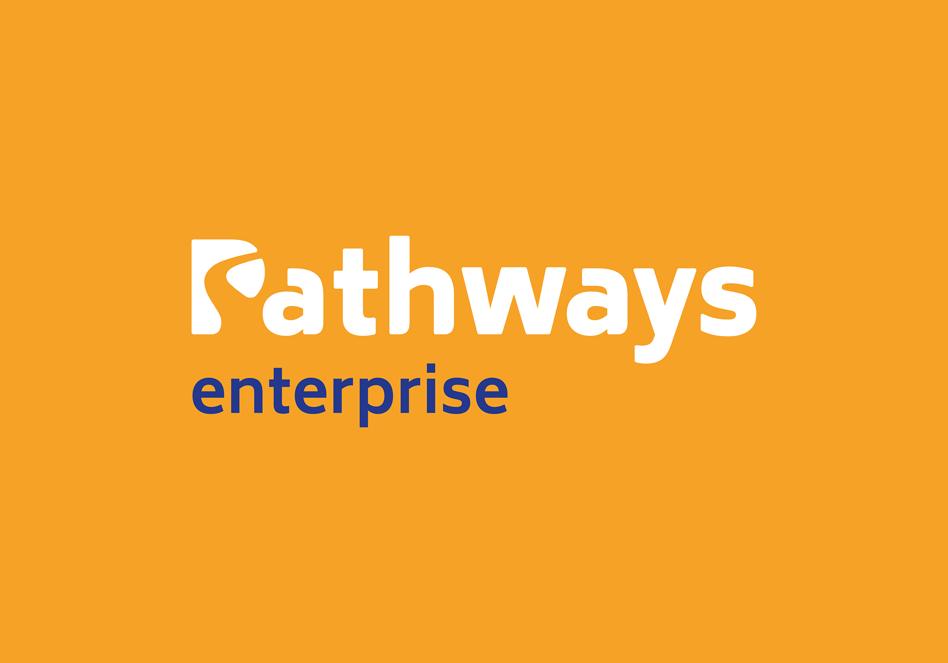
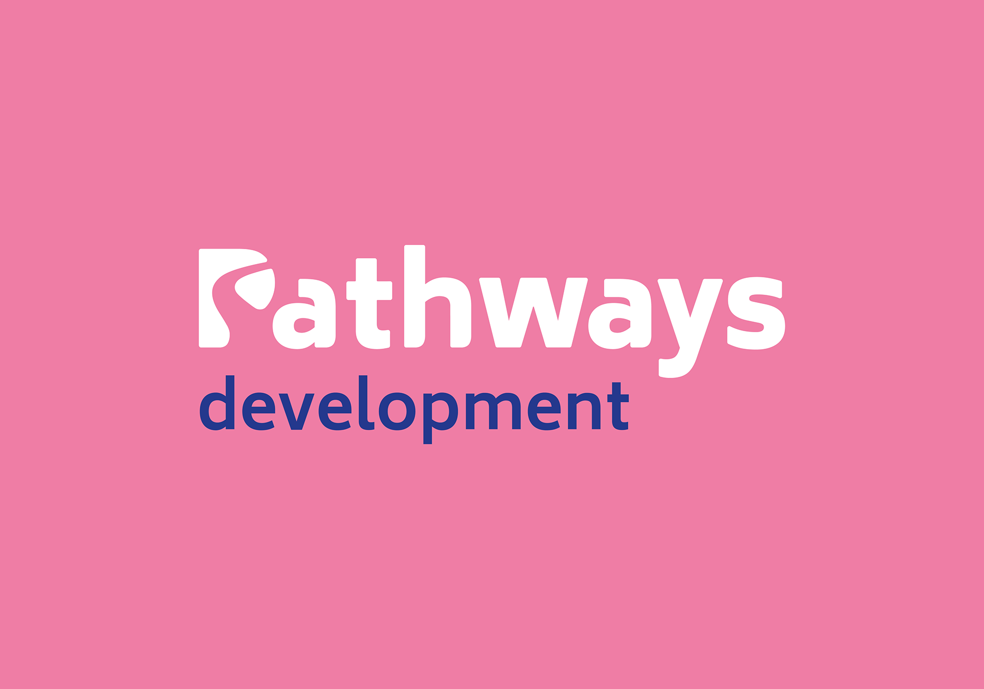
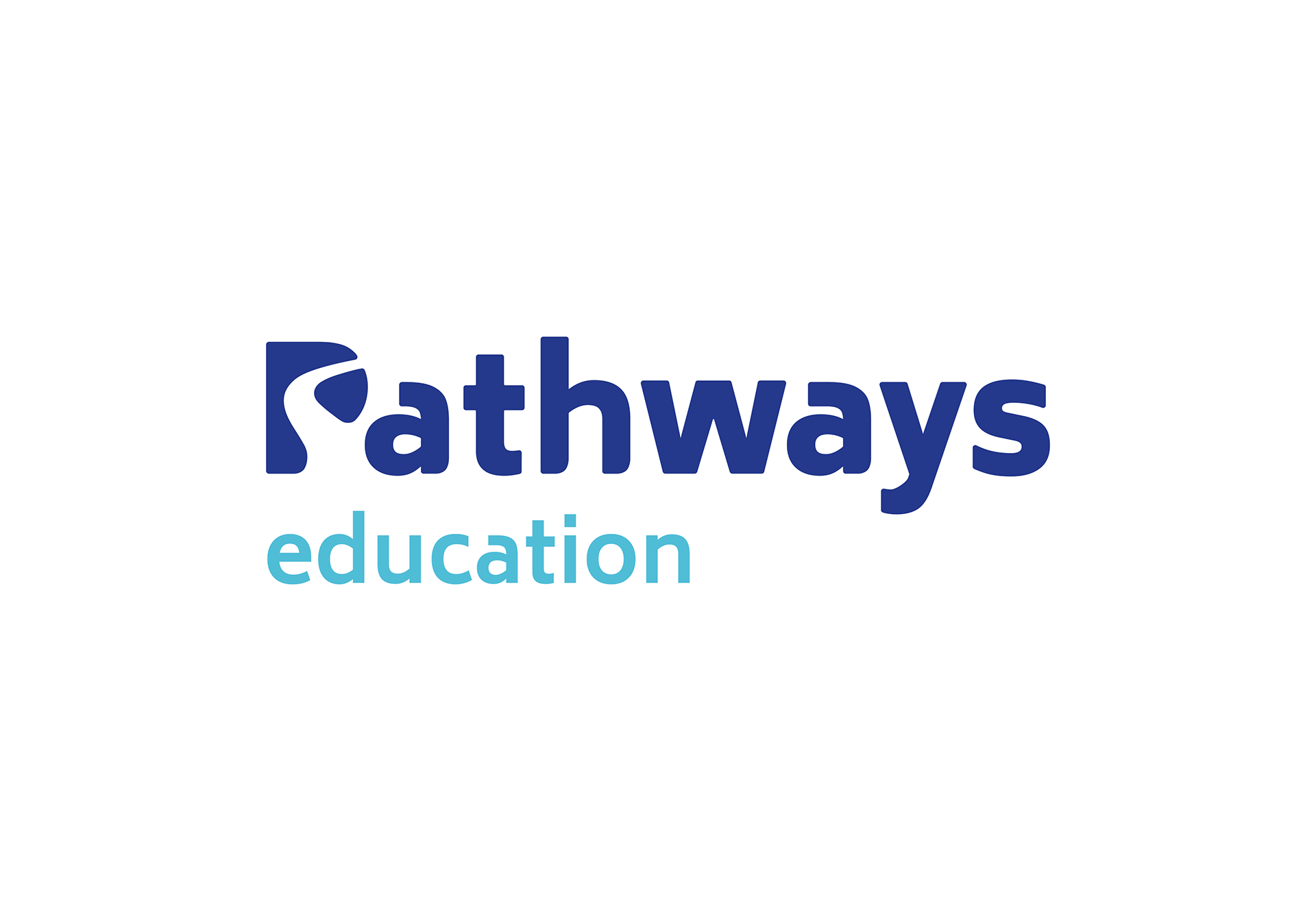
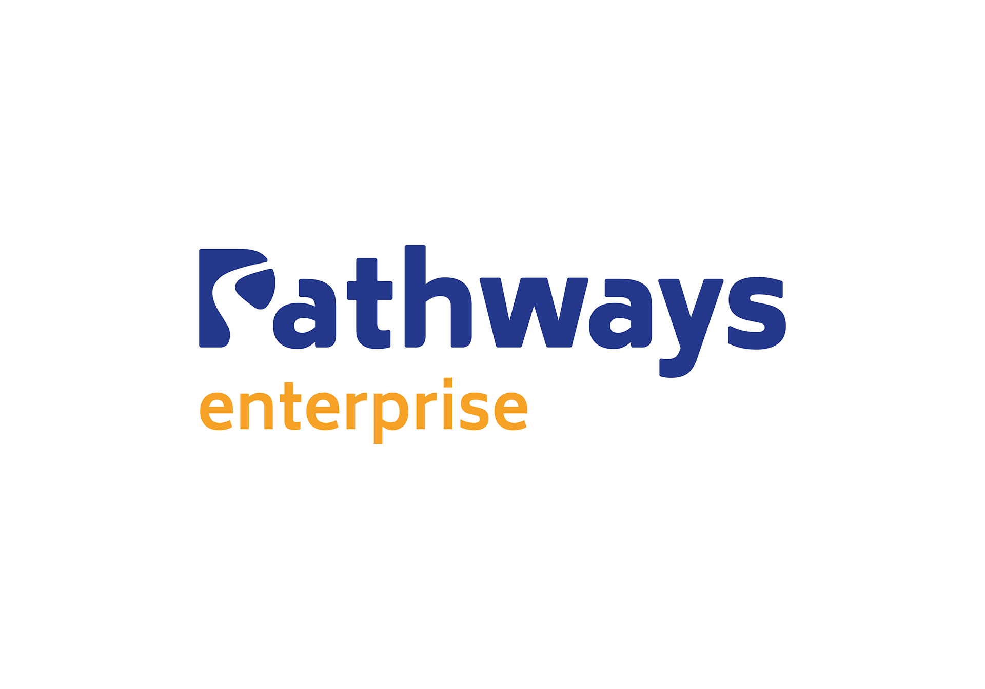
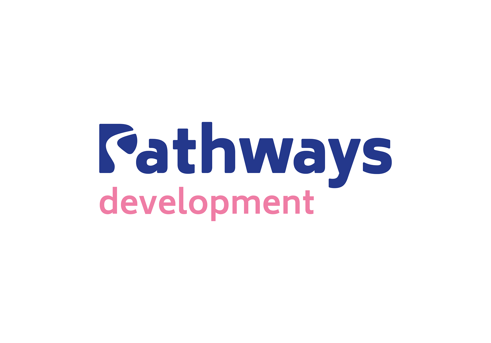
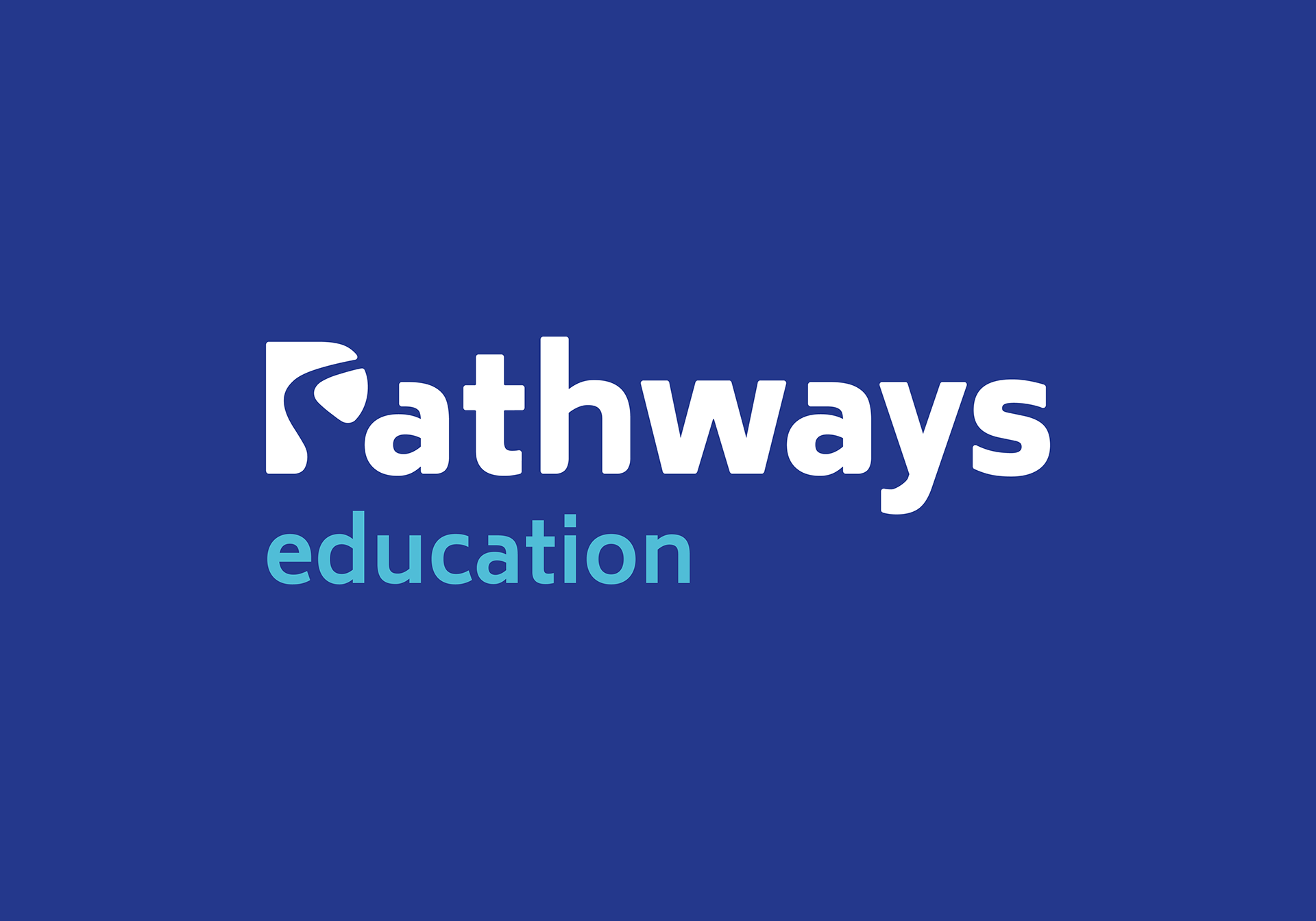
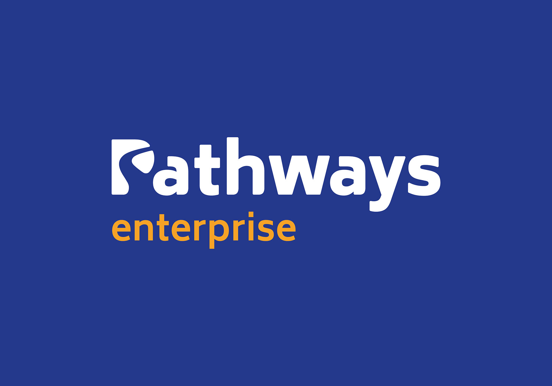
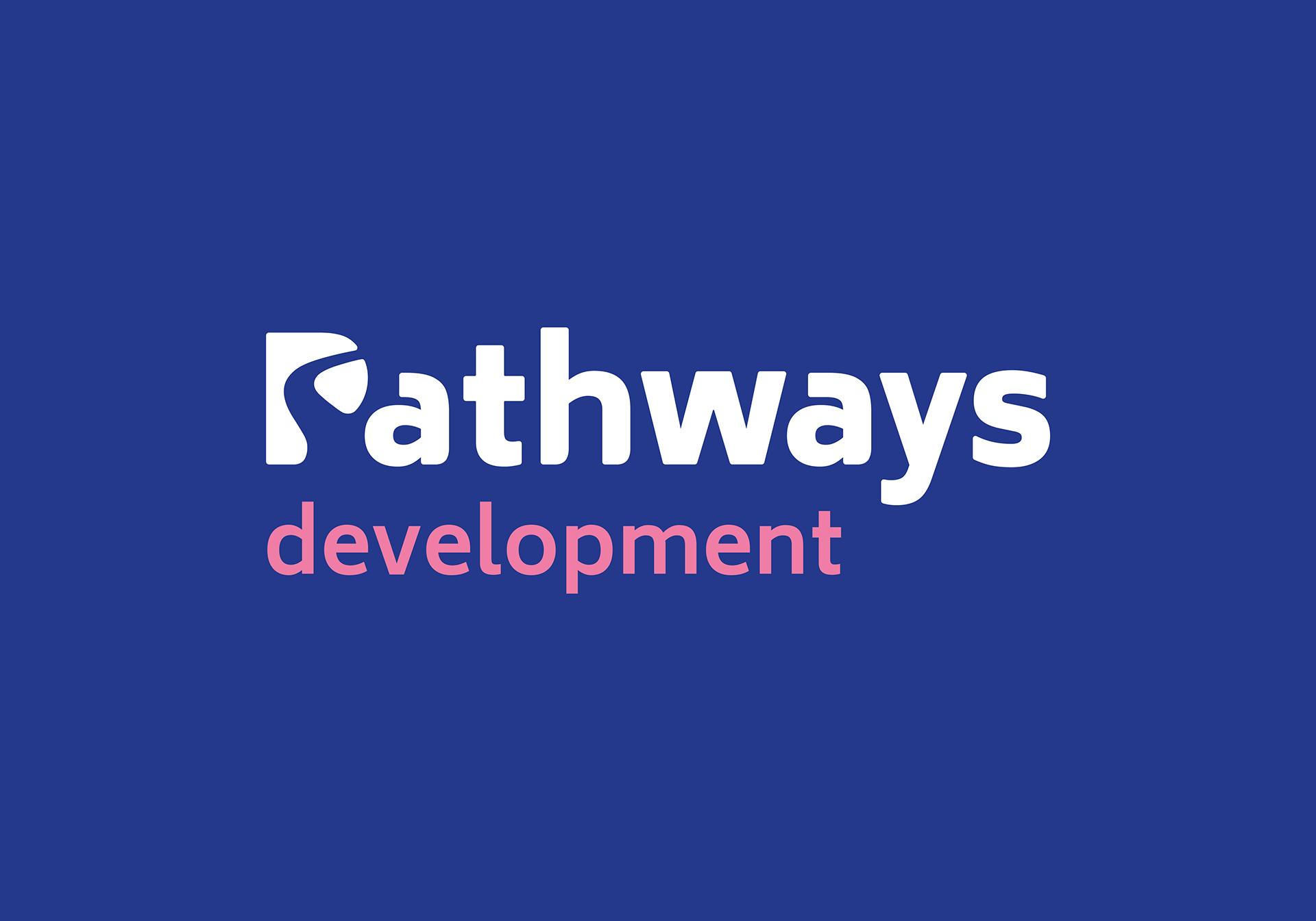
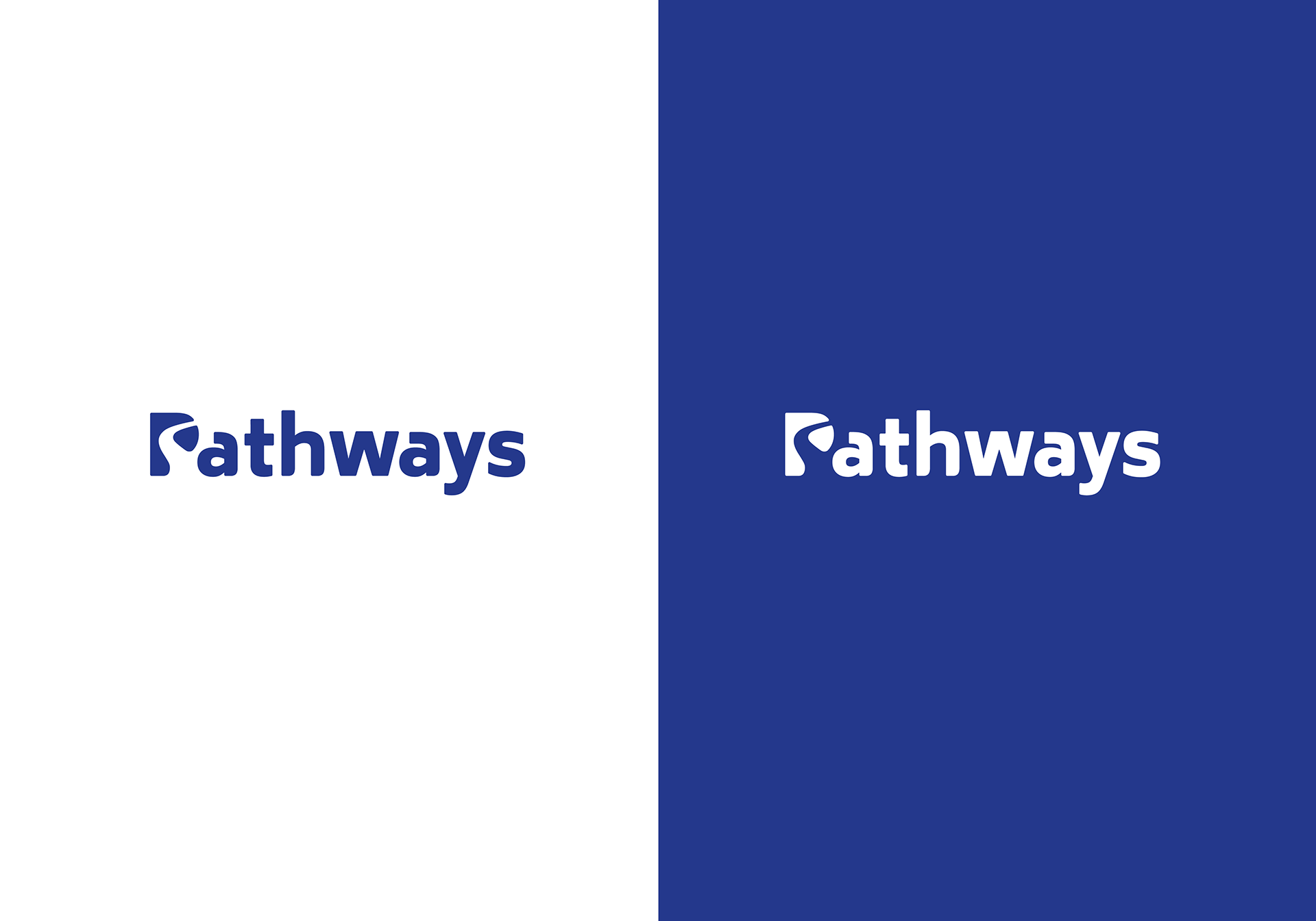
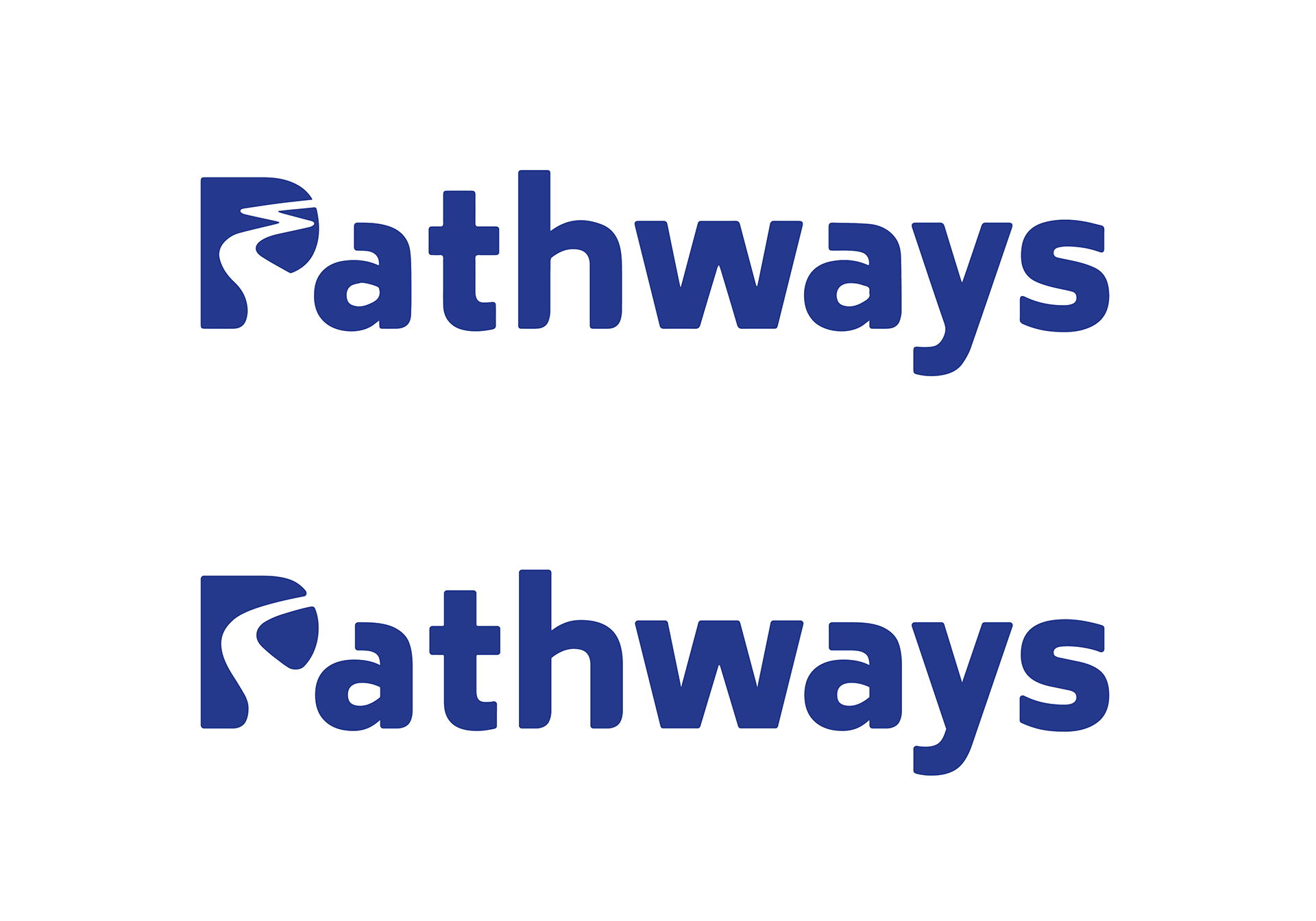
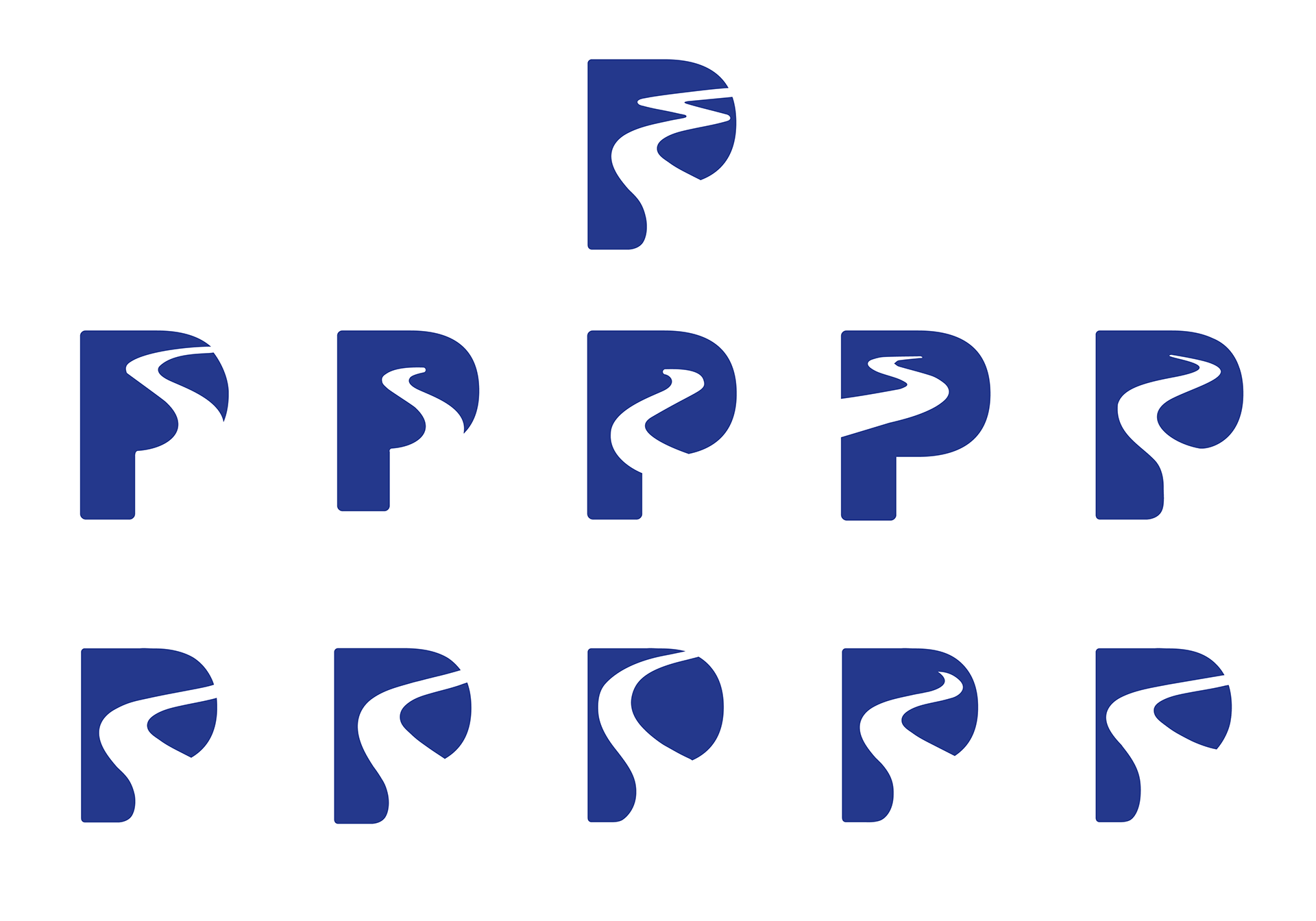
Taking inspiration from the logo they already had, I developed a simpler and smoother logo and brand mark that could be applied across a range of marketing assets, both as a whole or abstracted. Developing a colour palette that was to be used across the sub-brands called for a bright but complementary range to suit the purpose of the company.
Working with another agency, Pathways felt like they didn’t receive what they asked for. They turned to us to fine tune the logo and show them how it would be used across a range of outputs in their brand guidelines.
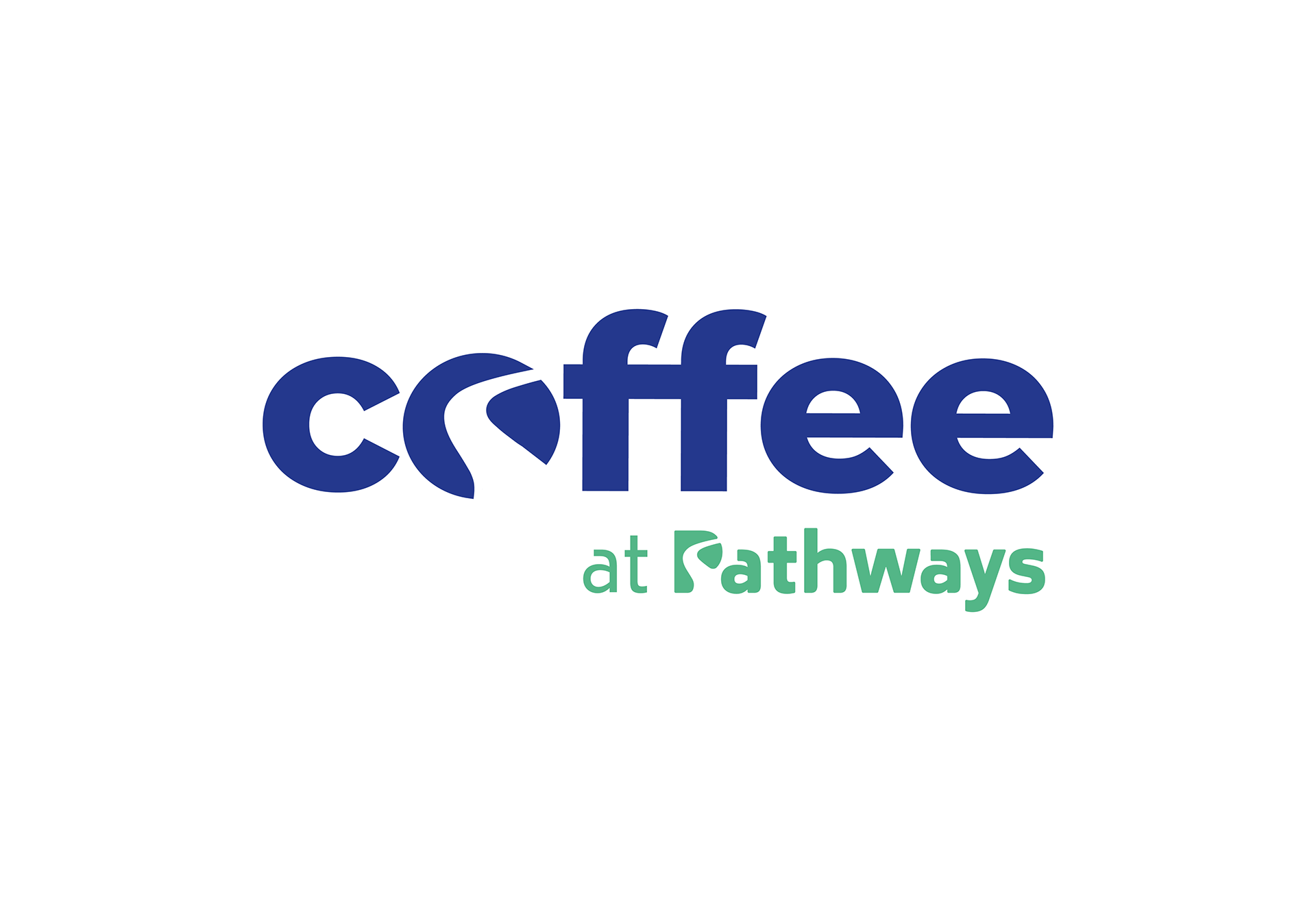
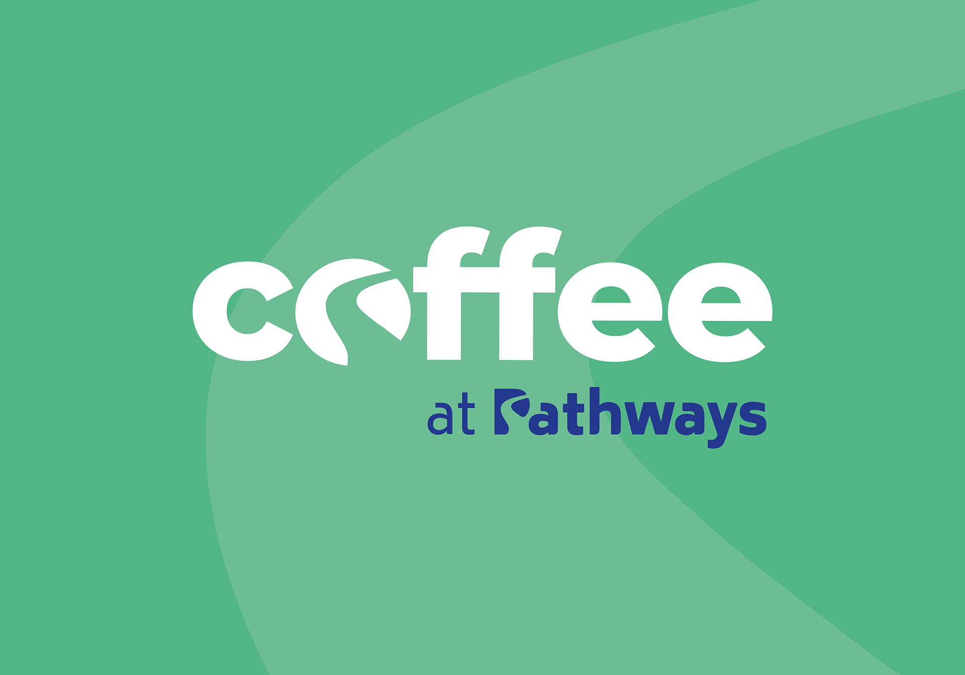

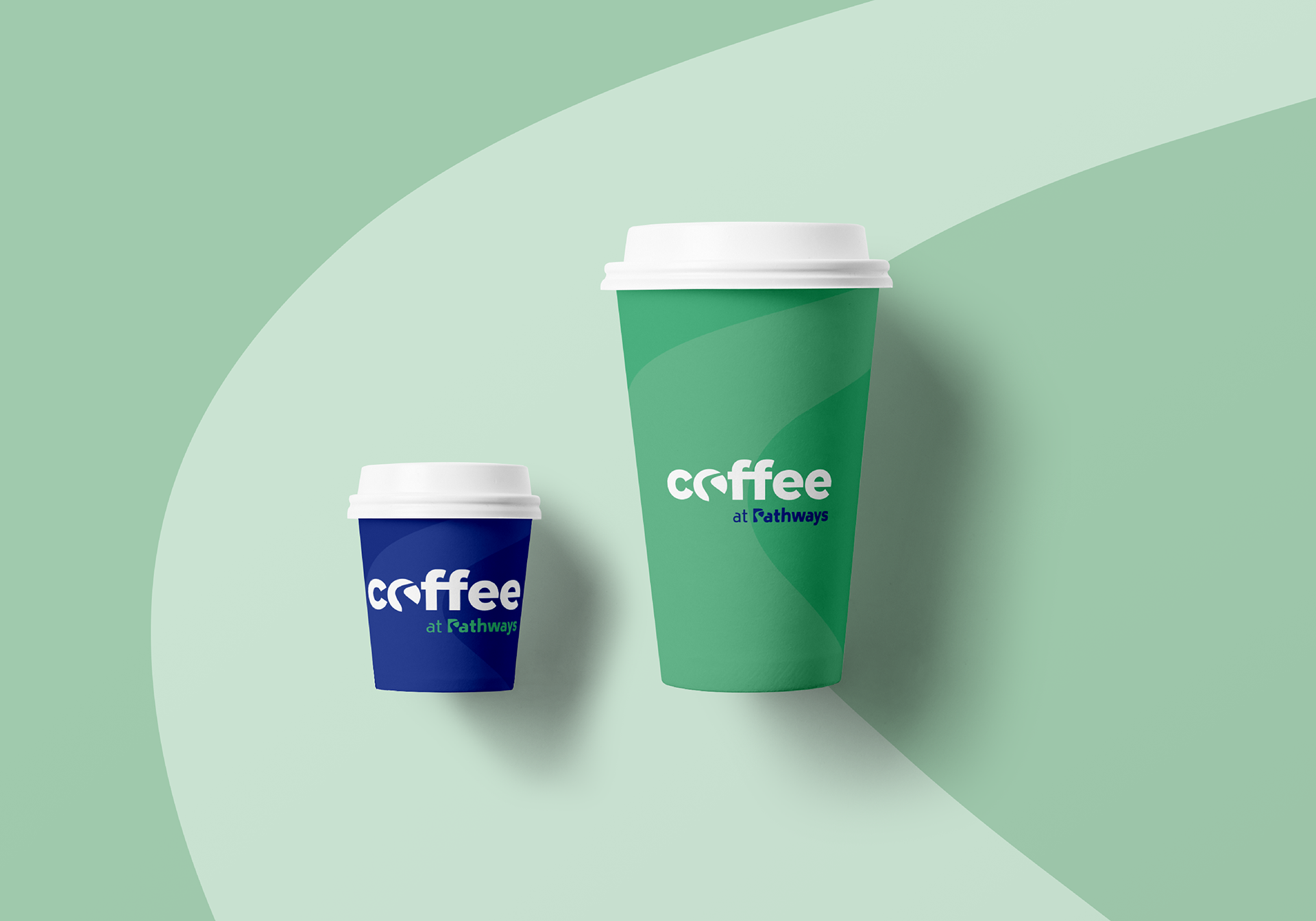
Sat within the grounds of the school is a coffee shop run by the students that attend. Simply named "Coffee Shop", the shop was a sub-brand of Pathways, and with the new path decal, used within the "o" of coffee resembles the split seen in a coffee bean itself. Using this to my advantage, I was able to maintain brand integrity as well as use the same negative space for both meanings of a path and coffee.
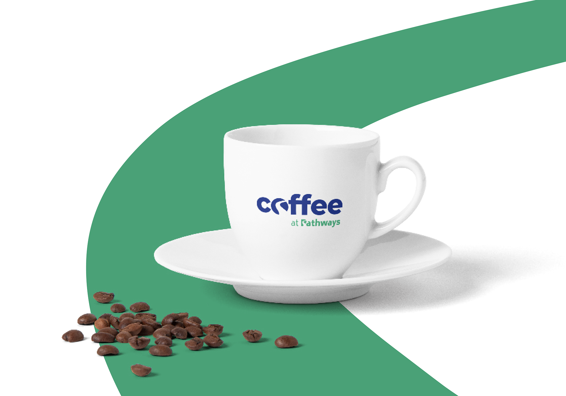
Pathways now have extensive brand guidelines as well as a scalable visual mark that can be used in backgrounds as well as the logo. This gave them consistency across all sub-brands and their target audiences. A brand mark that would be easily recognisable as “Pathways” while being distinctive enough through it’s application of sub-brands.