Using the brand styles of nando's developing a range of results page for a national survey
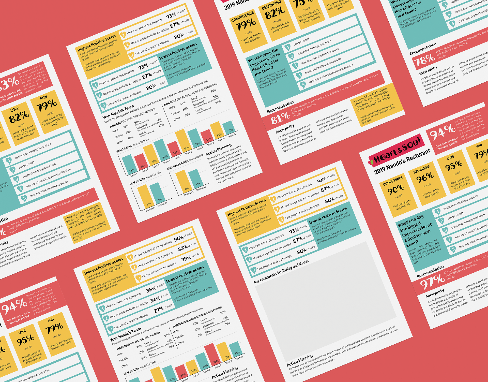
In previous years, the results of the National Employee Engagement Survey for Nando's was presented back in the online survey and unable to provide a downloadable and sharable results page. In 2019, working with a developer I created a layout and design for the results page which could be adapted to work across a range of levels of detail.
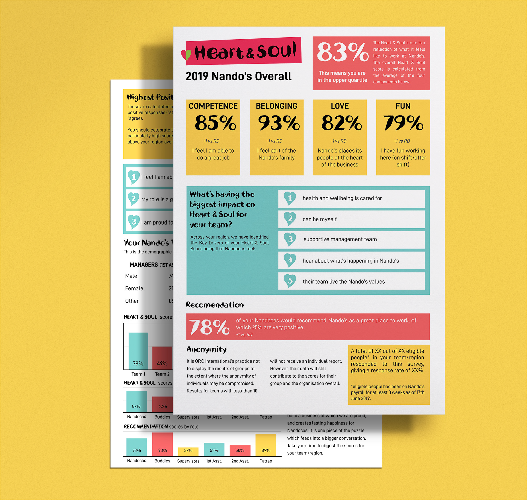
Using the brighter colours in Nando's colour palette, I created a vibrant results document that could be viewed online as well as printed - for those at restaurant level. Mirroring elements from Nando's brand guidelines, I was able to create a layout that could bend for the varying levels of data as well as being recognisable as Nando’s.
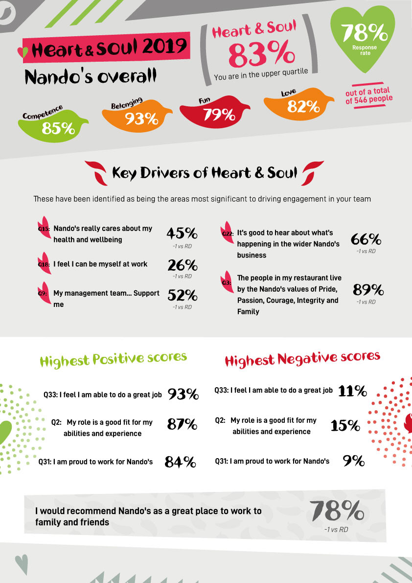
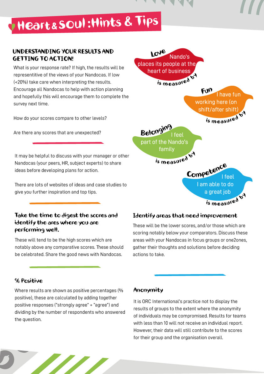
In my first iteration of design, I followed closely to Nando's main brand, using greys and background elements to evoke familiarity for the results. In further talks with stakeholders, it was made known that some restaurants and offices only have access to black and white printers. This accessibility issue gave me the creative freedom to develop a cleaner and more modern design that broke from the traditional brand.
After working with the developer, we agreed upon a design that could easily be coded and adapted depending on the information provided. This concept was sent out in 2019 at the end of the National Employee Engagement Survey and was received well by restaurants and managing directors alike.